
Pat Lipsky at Elizabeth Harris Gallery
For some years. Pat Lipsky’s point of departure has been a geometric structure of vertical bars interrupted toward their midpoints in a stepped rhythm. If this sounds rigidly systematic or detached, think again. As her recent exhibition of cool, elegant “Color Paintings” made clear, Lipsky is first and foremost a passionate, intuitive colorist who seems to translate her every experience or emotion into a wordless language of unpredictable hues. Her disciplined formats are not containers for color but are instead largely generated by chromatic relationships; the proportions of her orderly bands seem responsive to the character of their hues, so that the structure and emotional pitch of each picture appear inextricably fused.
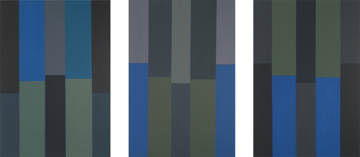
160 1/8" x 47 1/2"
Oil on canvas
Even the apparent severity of the contours is deceptive. Lipsky’s edges are delicately modulated, softened by the evidence of underlying layers of color, while the symmetry of her basic layout is subject to wide variation, as she subtly adjusts levels and widths or, like an inspired musician, inverts or syncopates her stated themes. The eye-testing trilogy of blue and gray paintings that includes Glauconome, Cousin Joe, and For Sigmund Engelberg (2005-06), for example, makes likeness and unlikeness into high drama, as Lipsky forces us to consider how varied tonal rhythms, shifts in level, and elusive nuances of color can alter perceptions. The overall deployment of color is often symmetrical, while the proportion of individual color zones is not. These conflicts tug at our vision, keeping us engaged and a little off balance.
Lipsky is a master of colors that not only defy naming but sometimes appear to elude seeing. A series of grid paintings from the early ’90s, not included in the show, were improvisations on permutations of blackness — seemingly monochromatic checkerboards of thickly worked planes that fractured, on close inspection, into a multiplicity of “colors.” A more recent, apparently straight-forward series at Elizabeth Harris, constructed with a restricted palette of clear reds and blues, makes the slightest difference between almost identical colors seem overwhelmingly important.
Lipsky’s most recent paintings are notable not only for the excitement she elicits from small distinctions — a rising pattern of horizontal breaks becomes a formidable challenge to a descending one, for example — but also for her uncanny ability to conjure up diverse moods, even places, through color. Remembered landscapes, changing seasons and seaside light haunt a gamut of blues from pure cerulean to slate, and a range of luminous grays pulse between lavender and green, or pale to pure atmosphere. The frontality of the paintings’ assertive surfaces notwithstanding, their space is unstable. Paired darks and lights, bracketing or interrupting the canvas, create momentary depths and then flatten out: staggered horizontal divisions combine with evocative hues to suggest everything from distant views to aggressive architecture. Lipsky’s complex, richly allusive visual counterpoint demands that we pay close attention to her paintings as paintings — mentally measuring, comparing colors and proportions, focusing intensely on her economical means — and then rewards us by setting free our imaginations.