Pat Lipsky at Andre Zarre Gallery
Joyous, difficult, silent, Pat Lipsky’s new paintings celebrate a profoundly noiseless experience of color. The din of chromatic exuberance deafens all senses save sight; these are shockingly beautiful pictures—and shockingly intelligent. The “system” here is a mystery of balance; a method not deductive but inductive. Judgment prevails over formula; everything is askew but nothing is out of context. The echoing color resonance, across a field of related but never repeating chords, is one of unremitting surprise. Taken together, these are simple, flat, abstract unities, constructed of abutting quadrilateral figurations, loosely assembled on skewed, gridlike skeletons. When one looks, certain forms converge suddenly—jutting into a cubic or planar discrepancy of the picture plane—only to recombine flatly with the context at the next movement of the eye. The sense of ease in the handling, the structure, the color, masks with deceptive accessibility the toughness of their conception. The concentrated power of this work is its very muteness, which makes us see.
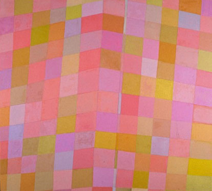
Nuances for C.G, 56″ × 62″, oil on linen, 1990
In Nuances for C. G., Lipsky spreads out a kaleidoscopic range of peachy, coral pinks—by all rights an overwhelming pot of treacle—except that she works against chromatic overkill by fashioning an image that floats the units of color like the afterimage spots that follow an encounter with a flashbulb. Within a grid gone akilter, she throws us a narrow-banded diagonal axis for an anchor, and carefully choreographs hue opposition and rotation, working subtle layerings and scrapings of one color upon another to maneuver the necessary respite from color fatigue. Occasionally, the drawing assists—in Love Letter planes overlap, flatly, like the flaps of an envelope; in Steeple Chase the linear web buckles into boxlike elements—but, inevitably, it is the color choice that provides the buoyancy in these works.
Their oil color is close in tone, pale and high-key. In the ten works on linen, the opaque color, worked by knife, resembles a surface of chafed suede: dry, almost encaustic vibrance when contrasted to the “juicy” translucence of the oils on paper. In all of the works the color is willful. These surfaces will neither sit back nor sit still; layered and napped, the colors lift and squirm. Nowhere do these closely matched sibling hues lock into mere pattern; even in the most regularly divided, such as He Walks, each element shifts forward from the vertical plane of the canvas, presenting to the viewer the indeterminate “space” that only the finely honed judgment of a master colorist makes possible on an opaquely pigmented surface.
These works are alive. Their ethos is light; they dance in the context of vision alone. They provide entry to a pictorially imaginative world—one that commands looking in a distilled manner. One hears much these days about the “discourse” of culture. These pictures insist, however, that we stop talking for a moment, and just look. They neither remember nor evoke nor record experience; they create it from scratch. The overriding impression from the show is one of authority—of coming home. Unapologetically a formalist since the 1970s, when (as Pat Lipsky) she earned critical acclaim and comparisons with older painters like Hans Hofmann and Ellsworth Kelly, after a detour into representation Lipsky slips back to abstraction in these works as if to her native tongue, working so naturally that she makes complex synthesis express itself as the simplest sleight of hand. These are images that proffer authentic experience—at the hand of an artist whose long career has not found the experience of beauty wanting.