The Right Color
Pat Lipsky’s New York Studio School Lecture, February 3rd, 2009
(Watch a video of this lecture.)
First I want to thank the Studio School for inviting me to be part of their Spring Lecture series, and for helping me to prepare this evening’s program, and thank you all for coming.
The title of my talk is The Right Color.
Mark Rothko said that an expression of beauty was “an expression of rightness.” Which of course ties in with my idea of “The Right Color.” Looking for the right color is searching for the next color in a composition so that all the shapes of the painting co-exist successfully, while each “carries its load” in the composition.
In his six-volume book, a la recherche du temps perdu, which has been an ongoing influence, Marcel Proust was searching for Lost Time. Much of my life as a painter has been spent searching for colors which will harmoniously work together to create, what Hans Hofmann called “a color world.”
And here’s Emerson writing on color: “Thus inevitably does the universe wear our color. As I am so I see.”
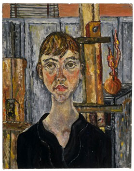
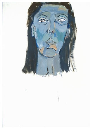
Here I am at age 16 painting in an art class. You can see my influences, pointillism, impressionism and Modigliani. This painting started my career, as the picture won first prize in the National Scholastic Art Award, and was shown at the NY Coliseum.
After I graduated with a master’s degree from Hunter College in 1968 I started working on a series of paintings based on logarithmic progressions.
These progressions when plotted on a 2 dimensional surface create curved lines. I’d worked out the curves mathematically with a slide rule and then drawn them onto the canvas. The paint was a layer of diluted acrylic. I did several painting like this in my first studio on E. 90th ST.
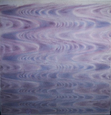
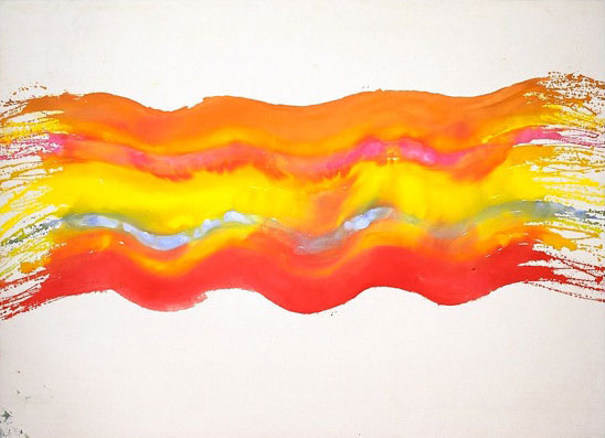
By loosening up the curves I moved into my first “wave paintings” of 1969 –here are three images.
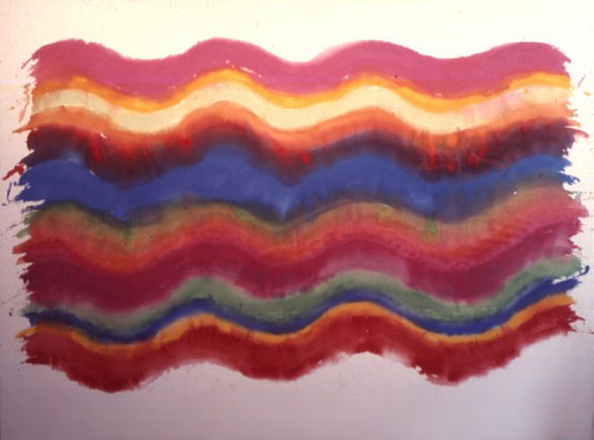
These were “one shot paintings” if they didn’t work they had to be thrown out, you really couldn’t paint on them again and retain the freshness.
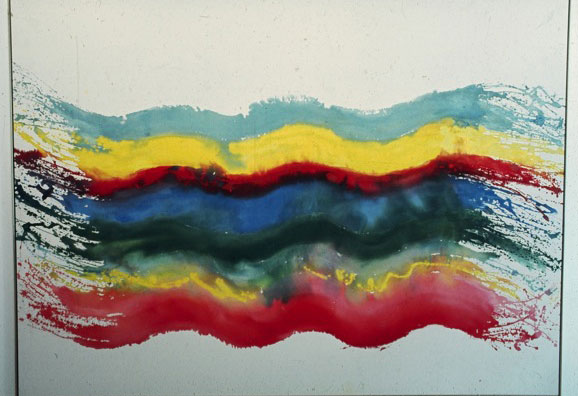
I was influenced by the ideas from the book “Zen and the Art of Archery” by Eugene Heregel when I did these. The writer talks about motor learning and control for any physical activity, including hitting your target and these paintings were like that, either you hit it, or you blew it, in which case, as I said, the painting was discarded. That notion of error was built into the process.
Some of these were shown in my first solo exhibition in NYC in 1970 at the Andre Emmerich Gallery.
When I made these pictures, although the colors were moving only laterally, I had to quickly arrive at the next “right” color while the paint was still wet. I sponged acrylic paint onto a wet canvas, it was a watercolor technique. Usually I saw the next color in my “mind” and my conscious job was to mix it.
Regarding these pictures here’s what I wrote in a memoir from about 1980:
“I got a studio on IIth st. I loved going down there. I would stop at Chock full of Nuts and get two coffees to go. The paintings from the night before would be lying on the floor. I’d climb on top of the ladder and look down at them. I remember the smell and the feel of the canvas. I have never been happier. I’d see how the paintings looked, whether I’d been on or off the day before. Then I’d hang them up on the wall, and see how they looked up. Then I’d tack some new canvas onto the floor and start working. The canvas would be blank, just like a big piece of white paper on the floor. I’d sponge the whole thing down with water. Then I’d start pouring color onto the canvas. I had these wonderful silk cosmetic sponges of different sizes that I’d collected. I’d dance, I’d play, I’d rub. “
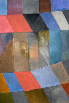
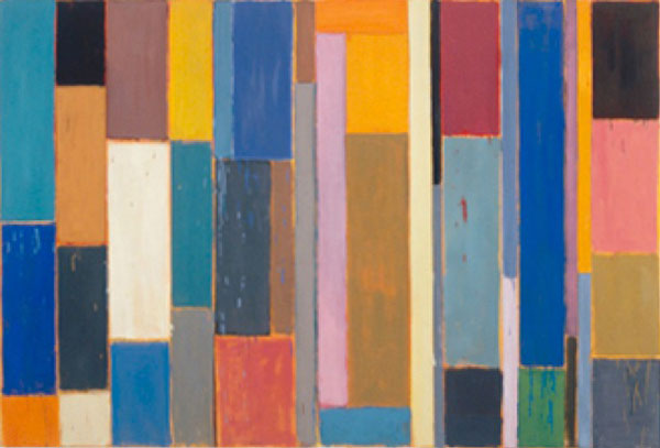
Here I’ve moved back to acrylic, in a painting based on a grid format. At the time, I suddenly had a strong instinct to work with this structure and went with it. Later I discovered that other painters, Richter, and Bartlett for example, unbeknownst to me were working with grids at the same time.
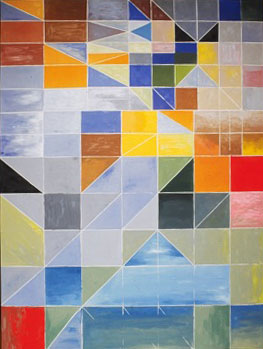
Here I was drawing into the grid with varying sized strips of masking tape, quarter inch, half inch, three quarter and one inch. The different size strips made different kinds of lines in the painting.
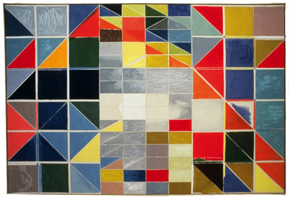
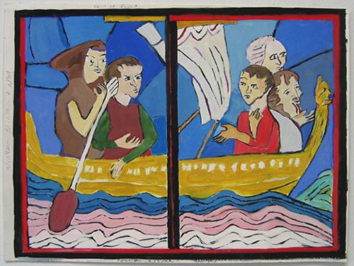
This painting is based on the palette of “Boating” by Manet at the Met from 1874 (painted 101 years before). I am especially fond of the light green/blue sea color in Manet’s canvas.
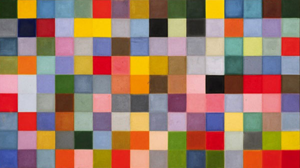
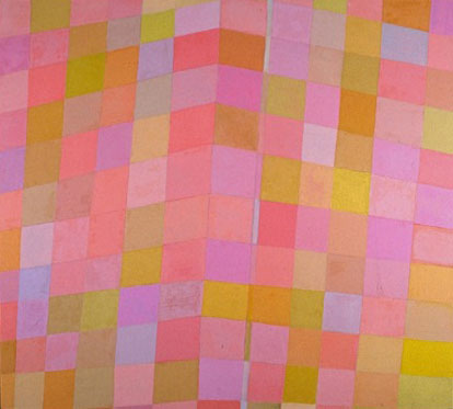
This came out of a small watercolor study, I would do several watercolor studies and then pick one that I thought promising. The large paintings were done on the floor, and stretched afterwards, giving me some play on the edge. I would duplicate each color from the watercolor in acrylic and then pour the paint into numbered jars, in this case 144. The paint was sponged and brushed onto the canvas, 10 or more layers of each color, in an attempt to create a blurred, velvety effect. This is the last painting of mine that my father saw, what he said about it was “to me it looks like dancing.”
I’m showing you now a few images from the early eighties. In general, “the Reagan Years,” the eighties was not my favorite decade.
I used an electric sander in the painting, an idea I got from Smith’s treatment of his Cubi sculptures.
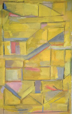
As you can see in this yellowish painting I am moving back to a more structured image, similar to the mid-seventies pictures. This was close to the kind of drawings I did at that time.
An asymmetrical, irregular grid-like picture. The title refers to my mother, as a memory of her early years, painted after she died in 1989.
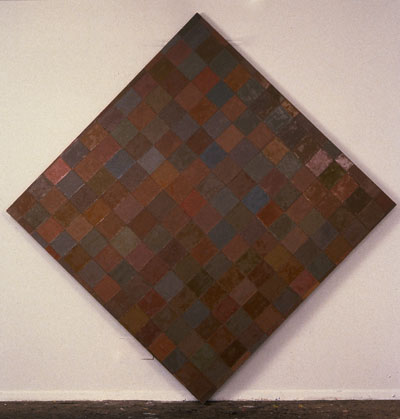
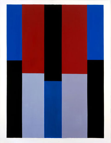
The C.G. in the title refers to the art critic Clement Greenberg, and the painting came out of discussions he and I had about Titian’s use of alizarin crimson, also called magenta, red purple (several names for this color). There had been a show of Titian’s work at the National Gallery in Washington, I think it was 1990, that Greenberg and I had both seen. This is a painting where the ideas of nuance and close value color become the subject. Close value color is staying within the range of one particular color, rather than working with contrast, or up and down the tonal scale. The actual word, nuance, means “a subtle distinction or variation,” which expresses one of the things I was attempting here. I wanted to emphasize small differences.
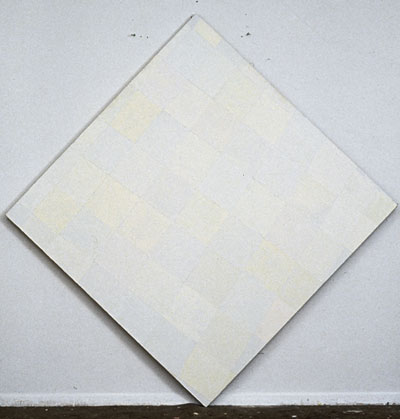
Sizes are from point to point on the diamonds. The painting takes its title from a 1961 poem by Sylvia Plath. This is the first diamond shaped canvas I am showing you. Throughout the nineties I worked with this structure, because I thought it activated the small rectangles of color more than a square orientation would, although I worked on the canvas in every direction. I also connected with the diamond shape canvases of Mondrian. This picture started with a lavender underpainting that can be slightly seen in the actual canvas, in the same way that Chardin’s black grounds inform the top layer of color in his late still lives. The painting also makes a reference back to “For Leslie” but this time in oil.
This was made in Paris, I was covered in stains of brown when I went to the neighborhood café for a coffee, and then:
A larger version was painted in N.Y. I chose to work with brown because it was the color I liked least, the color I’d always avoided. I wanted to see what I could find out about it.
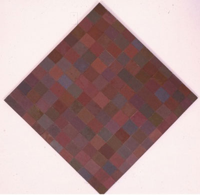
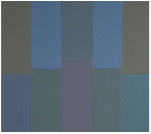
Throughout the nineties I continued with these close value color paintings, which were made with so many layers of oil paint applied with a palette knife, that the edges where the small rectangles met became ridged and were an important element of the total image.
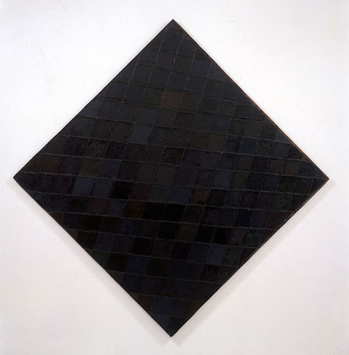
The last color I tackled was black, which is (along with yellow) often considered to be the most difficult.
One of the reasons for this is that black pigments are made with coarser granules than others colors causing the variety of blacks to sink into the layers beneath which can dull the surface. I had to work with this limitation coddling the blacks along, sometimes coating them with varnish. Mars, ivory, peach, lamp, bone, were the greater part of my expressive cache for about five years.
For me putting one black next to another started taking on the illusion of using all colors – for example I could make mars black look almost red if I put it next to ivory, paynes grey looked like light blue next to lamp black, and lamp black looked warm next to ivory. It was, I imagine, similar to composing for one instrument if you are a composer. And that is what the composer Theodore Wiprud, who is here tonight, did: he composed a three part percussion piece about the three last paintings of this series called Dark Love after this canvas. Here’s something he wrote for the play bill of the percussion performance which had the paintings on view at The Kitchen in Chelsea in 1999:
"…and from the first time I saw them I began thinking of how they might sound. Percussion would clearly be the medium of choice."
In 1998 I moved to a new studio in Chelsea, which starts the work of the last ten years.
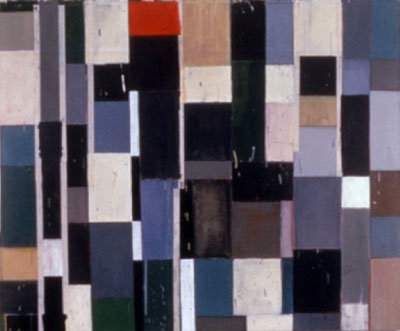
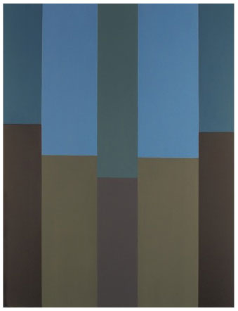
The title of this painting refers to a friend who had died the year before. I wondered if his spirit was in my new studio? In this painting I am working with what I’d learned using blacks in the reproductions of paintings we just looked at, while working with an abstract expressionist paint handling. The structured rectilinear format relates to many of my other pictures. The masking tape that was on while I was working, stayed on in the end, because I thought it added to the picture.
One thing I was experimenting with here was the thinness and thickness of the rectilinear shapes.
These are among the pictures shown in my first exhibition in Chelsea at Elizabeth Harris Gallery in 1999.
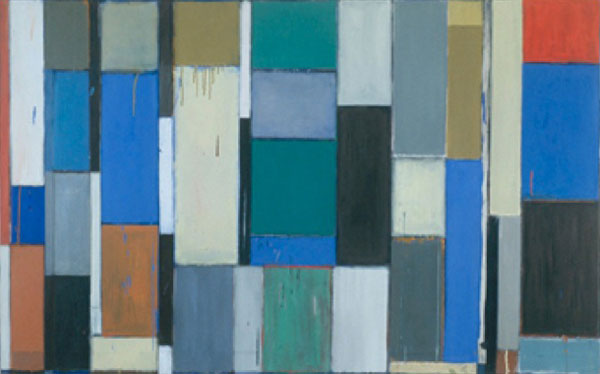
This was painted on an orange ground, and the under painting comes through in places, particularly between the lines. When I finished it, I identified what I had created as the feeling in my mother’s dining room.
Starting in 1990 I made several trips to Paris and the surrounding areas, because I’d become interested in early Gothic French cathedrals and stained glass windows. I’d read a lot about Bourges Cathedral, and then visited finally in 2000.
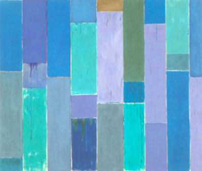
This is the first painting I did that relates to stained glass windows, not only in its range of blues, but in its more simplified structure.
In 2004, I first became aware of the extent to which my reading of Proust was influencing my painting, when I began work on a group of nine canvases that circulated versions of four colors in nine locations on the canvas. While applying red paint to the first canvas in the series, the tune from the song “Red River Valley” suddenly came to mind, and with it, a world forgotten for many years, centered on playing the piano and singing folk songs with my family as a child. The particular color of red on my palette opened these memories, resulting in an experience that Proust describes as “involuntary memory.” As a testament to the experience, I called the series Red River Valley. Each of the nine paintings has a white border, (which might be hard to see in reproduction), because each painting came from a small colored study on white paper. The surfaces now are smooth; there is no ‘interference’ in the paint handling. I had learned a great deal from studying early neatherlandish paintings in Bruges, Ghent, Brussles and Paris.
The four colors were variations on red, blue, black and white. I thought it would be interesting to see what effect, if any, location had on the way the colors read. There were only nine permutations possible, hence nine paintings to the series. What I discovered was that each color could work in each of the nine locations, if I got its modulation right, that is, if it were the right variation of the color.
I am going to diverge from my abstract paintings for a moment to show you a series of gouaches on paper that I did from stained glass scenes – there are usually ten or twelve of these small scenes in any one of the large 12th and 13th century French windows. I saw these on my trips to Troyes, Le Man, Potier, Chartres, Bourges, Sens, Cluny, and even at the Louvres between 2000 and 2004. The title for the series of gouaches and drawings on paper is “Les Vitraux” the French plural for stained-glass window. I was attracted to the images for many reasons not least of which that they reminded me of flat 20th century paintings.
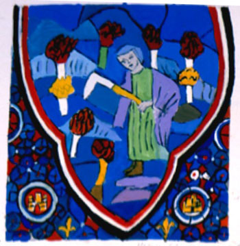
This is from Bourges Cathedral, I would spend the day at the cathedral drawing the scenes that interested me and writing down the colors. Then when I got back to the apartment where I was staying in Paris, I would paint the gouaches from the drawings and color notations I’d just made. Bourges has windows lower than those of other cathedrals so they were easier to see. The black line down the middle of this work reminded me of a Max Beckmann diptych. In the original the line is actually lead that is holding the two panels of glass together.
This was one of the earliest scenes I worked from in Paris at St. Chapelle. (Most of the other early cathedrals with glass are within a two-hour range of the capital. The slight mountains in the upper section reminded me of Lux, calm et volupte by Matisse.
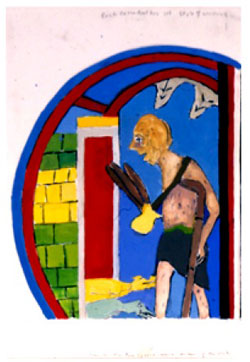
I loved the idea of a ‘bad rich window’ (le mauvais rich) although the rich always seemed more lively in these scenes – the good people were kind of boring and usually dressed in white. I was taken by the image of the leper with the dogs at his feet and I have to admit that my first thought was not of art but of a Lenny Bruce joke about lepers walking down fifth avenue. I also enjoyed the left side brickwork, which made me think of a Noland.
To my eye, the figure of Mary on the bottom was a dead ringer for a Balthus. A slightly different version of same subject is at L’Oeuvres Notre Dame de Strasbourg, so I ended up working with this subject twice.
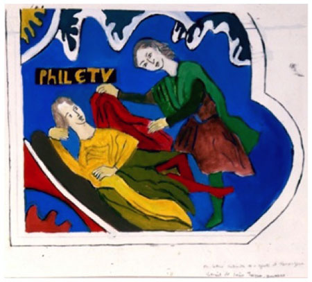
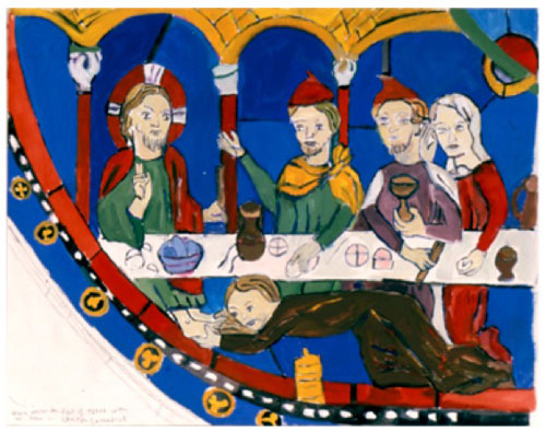
I loved the charming woman in red stockings on a divan circa 1300, trying to seduce the would be saint, Philetus who at the very last moment is saved by God.
I thought these anonymous artists were the original French fauve painters, that they showed extraordinary skill in high key color. I wasn’t interested in the stories at first; I looked at the windows the way I look at abstract paintings. I began to read about the meanings only later. In a way the whole assignment that I gave myself was an excuse for basking in the beauty of the early glass. This statement from a Roman Antonius seems to sum up the medieval idea too “If the picture is good who cares who made it.”
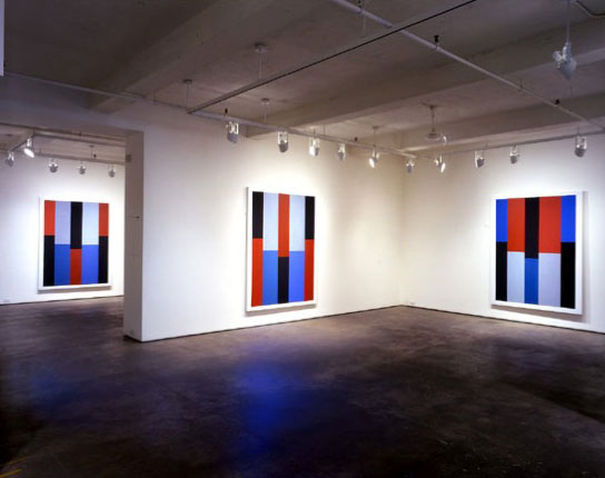
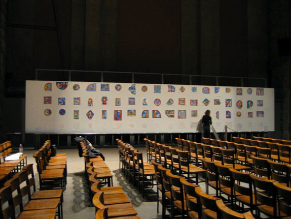
Reproduction misrepresents art because everything appears the same size. These are little paintings on paper and my canvases are often wall size, but here tonight everything is projected as if it were the same size.
Continuing with smaller work …
Porphyry is the name of a red purple stone that some of the columns at St. Marks Cathedral in Venice are made from. I tried to simulate the color in this etching. You can see it on the edge, and in between the rectangles. The first plate of the print had the reddish color everywhere you see it, and also under the blacks.
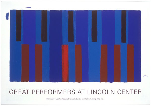
The Lincoln Center print is a 16 color silk screen that is from a drawing I did of upside down piano keys (I decided to confront the piano key thing head-on here).
Sometimes I like to remember what it feels like to let my “hand” show.
In my paintings of the last several years I’ve specifically been dealing with the whole flat, non-hierarchical plane. In that sense, in addition to being synoptic, these canvases are democratic. It’s not a new idea. Here’s a statement from Augustine from his book of de Musica, 389 A.D. “The higher things are those in which equality resides, supreme, unshaken, unchangeable, eternal.”
When a painting succeeds nothing dominates, nothing “fixes” too quickly, nothing settles. This allows for different “readings” — the flat surface doesn’t impose a figure ground relationship — one hopes that each shape connects with its color, as the proportions and colors have to be convincing for the painting to succeed.
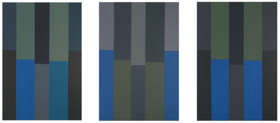
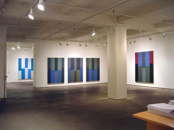
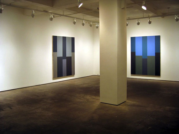
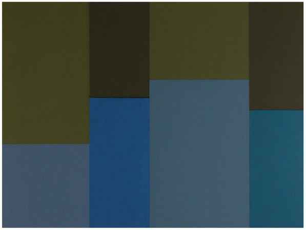
A three part painting that was done on three separate walls of my studio. I was circulating colors as I had in the RRV series, but here there is no limit to the number of colors, and the palette has changed.
One of the ideas I have been focusing on for the last few years is the notion that there are many more colors than are named in our English vocabulary. I call these “no-name colors” ones that defy naming, (and unfortunately often reproduction). These paintings feature small differences that become important in context. Like the earlier series they are not symmetrical. These paintings are built up with countless layers that become, in effect, the history of how hard it is to get “the right color.” When Titian was asked how he achieved the quality in his paintings he replied “thirty, forty glazes.”
Proust writing about the sea had this Hericlitan insight: “I never saw the same sea twice.” The sea itself looks different depending on the sky, the light, the time of day. I was thinking about that when I painted this picture and also about how color too changes depending upon what is next to it. And like the sea it’s almost impossible to get the same color twice. The largest numbers of metaphors in Proust’s six-volume work are about the sea, which obviously influenced this title.
This title refers to Ingres’ Odalisque in Grisaille, 1824-34, at the Metropolitan Museum. Because of its mastery of close value off whites, I had admired the Ingres for many years – and it was a take off point for this painting.
The title refers to the blue of the outer columns, which, because of the nature of the pigment Cobalt, had to be painted over and over to get the color smooth.
This was done at the same time as Cobalt. The edges between the shapes are continuously rubbed with cotton tipped applicators, so that they read as soft, not hard. I was interested in blurred (soft) edges even in the early abstract paintings when I used sponges to get that effect.
A small picture that took place over a three-year period. It’s named for a character in T.S. Eliot’s “The Waste Land.” Quote: “If you see dear Mrs. Equitone; Tell her I bring the horoscope myself; One must be so careful these days.” I worked on this small picture for so long I thought I was Mrs. Equitone.
This painting is the same size as Poussin’s “Landscape with a Calm” 1651, from the Getty, that I admired in the Poussin and Nature show at the Met last winter. I drew the painting at the exhibit and worked out the composition based on what I saw as the divisions in the landscape.
Although structure is important in my painting, the leading element has always been color. As with beauty, in the last thirty or so years the importance of color has diminished in the art world. (As if painting didn’t have to do with colored stuff called paint.) But then painting itself has diminished as we’ve seen in so many Whitney Biennials, and galleries around Chelsea.
When I first started painting I was inspired by Rothko, Hofmann, Louis, Noland, all colorists, all coming out of the work of Matisse. Where are their equals now?
At the same time you’ve probably noticed that there has been a devaluation of beauty. This was perhaps first stated in print by Robert Hughes in Time Magazine, 1986, in his famous pan of the Morris Louis Retrospective at the Modern which ended with the question “but is beauty enough?” For over 500 years beauty had been enough, now Hughes wondered. The showman, trickster Marcel Duchamp who said he hated art, and museums, preferred chess and breathing, considered the shovel art (to my mind, the perfect object with which to handle his work) first started this question. When I respond to a Titian, Bellini, Rembrandt or Pollock, it’s the beauty, the “expression of rightness” as Rothko put it, and that I opened this talk with, that is responsible. And that’s what I have the “audacity” (to use a word made popular by our new president) to attempt in my own work. For me that is enough.